How to Draw Comic Cover Art
In celebration of Comic Book Day, we're giving you an insider peek into what it's like to be designing covers for some of the biggest comics around.
We chatted with veteran cover artist David Nakayama who has designed covers for Marvel, Hasbro, DC, WB, Capcom, Valiant, and Fantasy Flight Games, just to name a few. In this interview, he sheds light on what makes a great cover, the importance of portfolios, his day-to-day, and more.
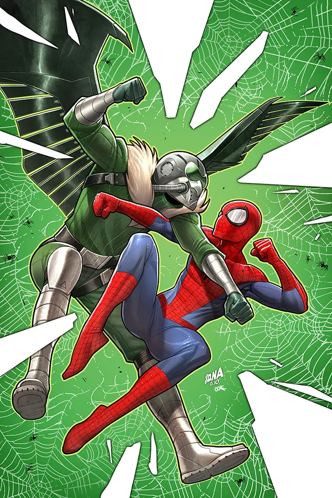
What path led you to where you are today?
Even when I was a little kid, I was always doodling things for fun. At first comic strip characters like Garfield, then NES characters like Mega Man (does that date me too much?!), and eventually I discovered comics. In the early 90s, my neighbors were reading things like Uncanny X-Men, and the Jim Lee art in particular just sucked me in. I thought it was the coolest thing I'd ever seen, and I instantly became both a comic reader and an artist for life. For me, it really was like flicking a switch. I guess from there, it was a 15-year quest of practicing, art schools, and showing around my portfolio at comic cons until I finally got a nibble.
What makes a fresh and eye-catching cover?
It helps to do research for sure. I like to look at all the covers in the Previews catalog each month and see what people are doing (or not doing). Certain palettes and compositions are reused everywhere, so I try to avoid those. High-concepts, humor and outside-the-box thinking can really help as well. But at the end of the day, it's always about PUNCH. What pops? For comics especially, I'm always trying to find the most energetic way I can depict a given character. So, I lean on techniques like foreshortened perspective, high-value contrasts, graphic touches (like stroke or pattern), and bright color juxtapositions. When going for an iconic hero shot, I ask myself 'would this look good on a t-shirt?'
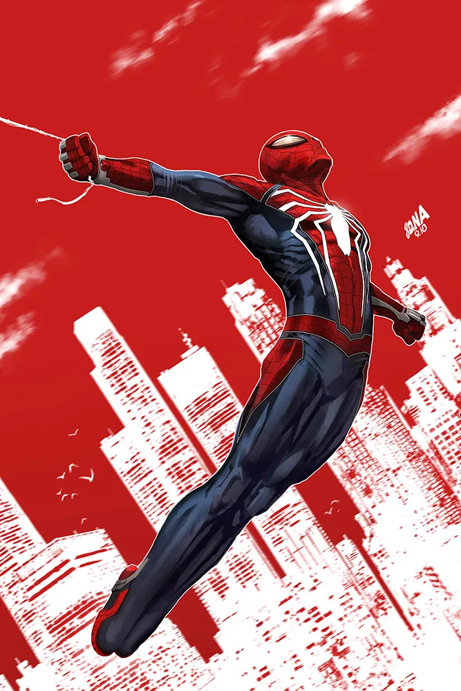
I did a cover featuring the PS4 Spider-Man (for Marvel's SPIDER-GEDDON crossover series) that people really seem to like. It's a single-figure hero shot that captures the very end of a swing, with Peter perhaps taking a moment to breathe before gravity pulls him back down. It captures a feeling, I guess? I think it uses the compositional space pretty well, and I like the way the figure pops against the posterized city and flat red behind him. Simple, but effective. My other personal favorites typically have a gag or visual gimmick in them, but this one was just pure and didn't need anything else.
What does a typical workday look like for you and what does your creative process look like?
I'm not a morning person, so I tend to start my workday with email. After my brain's warmed up, I dig right into whatever project's most urgent, and I try to get something done before lunch. Throughout the day, I try to work an hour or two at a time, then take a mental break. At night after the kids go to bed, the house is quiet and I get 2-3 more productive hours before bed.
In terms of process, these days I'm basically working 100% in Photoshop with a mid-size Cintiq monitor. I experiment all the time with the process, but right now my methodology is more or less: layout thumbnails, then rough sketch, then tighter lines, then flat colors, then dark and light volume layers, then bake it all down and paint on top.
How important does your portfolio factor in getting the job?
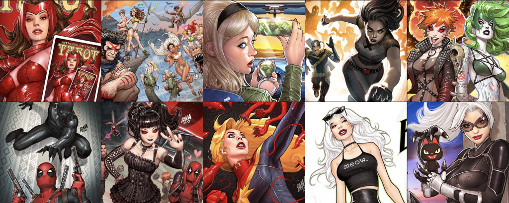
It's been absolutely essential to me. Honestly. So many of my best clients – huge brands that you've definitely heard of – have found me expressly because of my ArtStation portfolio. No, this isn't an ad or something I was asked to say; it's just true. Other social media like Instagram, Twitter, Behance, and others have helped as well, but it's pretty obvious to me that the most serious art directors with the best assignments are looking at ArtStation. Back when I was an art director in video games and had to hire people, that's definitely what I'd do.
"It's pretty obvious to me that the most serious art directors with the best assignments are looking at ArtStation."
Younger artists have no idea how much easier it is now to find work. Years ago, I got my first professional work at comic conventions by showing actual paper to actual people in person. But now, if you're good and online, people will find you. What a luxury!
What do you think are the key qualities that it takes to be a great comic cover artist?
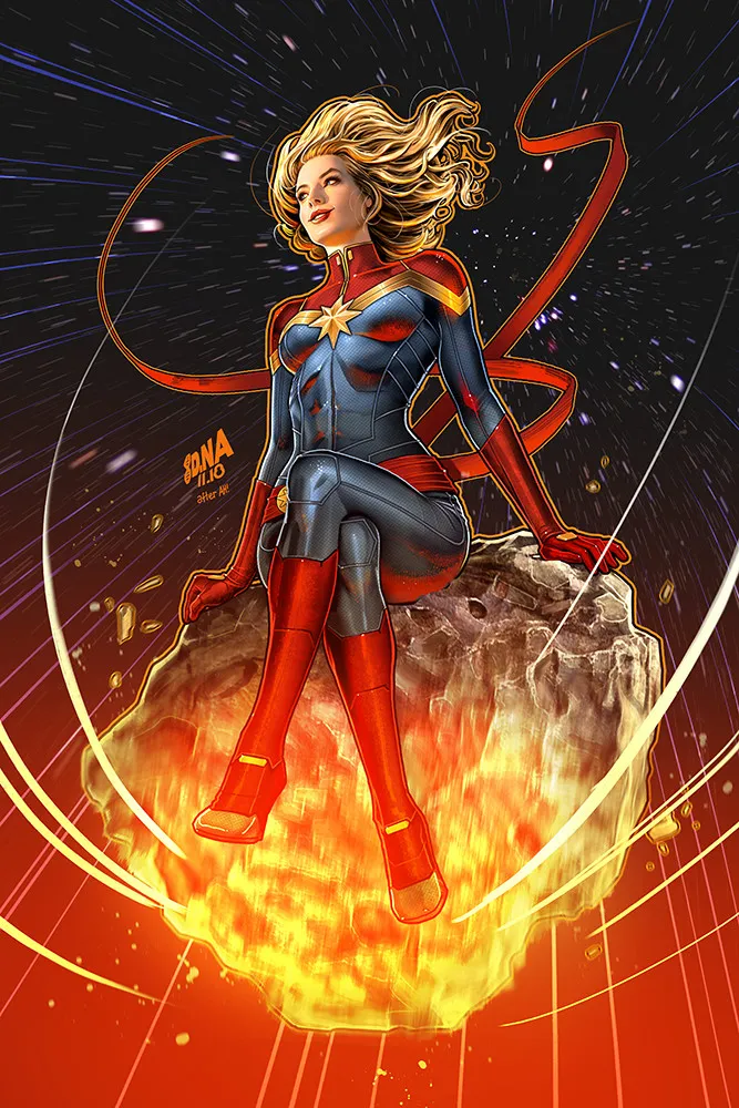
It's a lot of things. Great craftsmanship, timeliness, people skills, and the ability to handle a critique are pretty much required. But on top of that, I think it helps a lot to have a sense of humor, tell a story, embrace sex appeal, use a visual gimmick, and/or think laterally whenever possible.
Sometimes a cover assignment is just a straight-forward Hero X punching Villain Y sort of thing, and all you can bring to it is strong drawing. And that can be fun. But my favorite covers are the ones that make people light up, react, and share it with friends. In that case, it's almost always the idea plus the execution that makes people care on that level.
What are some of the biggest challenges or frustrations you had to deal with in this job?
For one, multitasking. I'm a freelancer and work with several different clients in a given month. The downside of this is that you have to juggle different overlapping deadlines. I mean ideally, I'd prefer to work on one project from start to finish over the course of 2-3 uninterrupted days, but in freelance, that's sometimes not realistic. Sometimes you have make sure that Client A has the sketches they need for approvals while Client B's unexpected notes need to be addressed right now and you'd been planning instead to paint a cover for Client C.
Another thing is time management. Because it's impossible to know exactly how long something's going to take, I find it hard to finish exactly when the calendar says I should. Days slip, and it's stressful trying to catch up. Somehow everything works out, but I haven't yet learned how to remove the stress part. Up until a couple of years ago, I used to kill myself with marathon work sessions and all-nighters, but I just can't physically do it anymore. Now I find it's more effective to work slow and steady to avoid burnout and wasted days.
There's also taxes, business, and money stuff to take care of, and the less said about that the better. It's not why anyone gets into art, but it's a necessary evil.
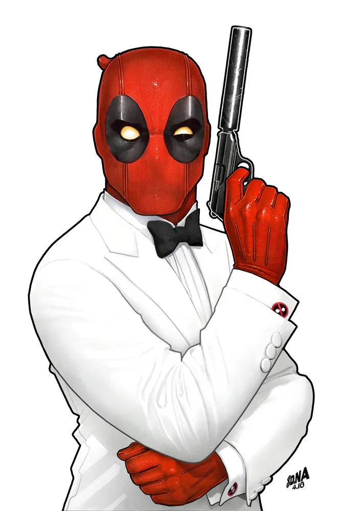
What advice do you have for any aspiring comic artists?
The internet makes it amazingly easy to share your work–yay! But the double-edged sword here is that you're now competing with artists around the globe for the same jobs. Yikes. That means it's a meritocracy where quality is everything, so how can one get better?! Turns out, there's no substitute for hard work. Unless you're the 1-in-a-million natural art genius this generation, then you'll have to hit the books and spend the '10,000 hours' required to master anything in life.
Frank Cho once told me to copy an anatomy book cover to cover twice to get that information into my head, and for me, that worked. It was painful. It sucked. But it worked. I recommend Figure Drawing For All It's Worth by Andrew Loomis for the thought process and The Human Figure by David Rubins for muscle diagrams. It's true what they say about wanting something bad enough. If you have that inner drive, you'll get there.
Follow David Nakayama on ArtStation, Instagram, and Twitter to stay up to date on his latest work.
Source: https://magazine.artstation.com/2020/05/comic-book-cover-artist-nakayama/
0 Response to "How to Draw Comic Cover Art"
Post a Comment